Portfolio
Occatu
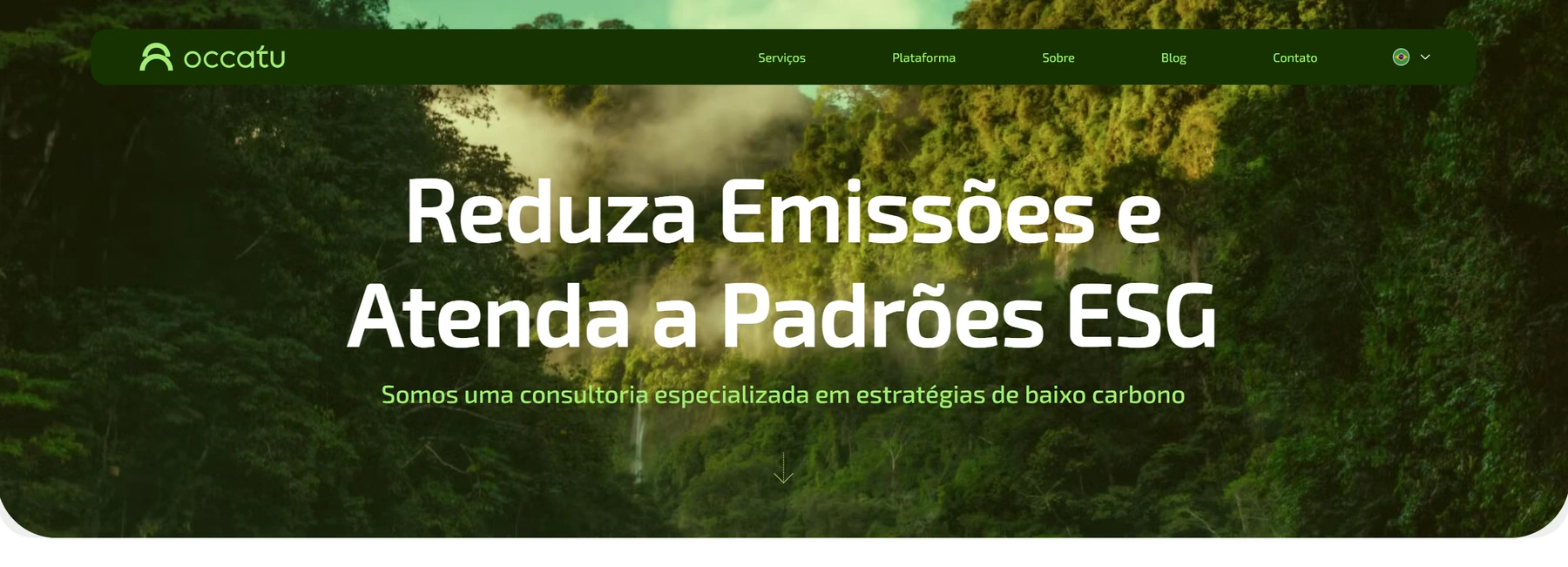
Occatu's challenge was to change how its clients and leads perceived the company, so they would see it as more modern and technological.
- Discipline
- Web design
- Client
- Occatu
- Year
- 2024
- Role
- UX/UI Designer, Nocode developer, Copywriter
Metrics
- Average pages per session
- +17%
- The average number of pages people visit during a session
- Bounce rate
- -19%
- Visitors who left the site after viewing only one page
- Average session duration
- -52%
- The average time people spend on the site went down
- Pages delivered
- 100%
- The project as a whole was finished and 7 pages were delivered on time
Context
Occatu, formerly known as Fábrica Biológica, is a company with over 20 years of experience in consulting and low-carbon strategy. In 2024 it decided to invest in a SaaS platform to increase its capacity to serve clients. That made it necessary to take on a new market positioning, and a new website would be essential, since the company operates remotely.
The site had to follow some requirements from the visual identity, showing robustness and modernity. The visual impact had to be strong enough to show the change between the old site and the new one, using more advanced technology resources.
Problem
How do we make clients and leads see Occatu as a serious company, capable of solving complex low-carbon management problems?
Responsibilities
- UX/UI Designer
- Nocode developer
- Copywriter
- Facilitation
- Client service
Deliverables and metrics
The main goal of the project was to launch the new website so the company could start its new online positioning, since this took other touchpoints, such as social media, into account.
The company had no access to traffic metrics for the old site, so we could not define a metric for comparison.
Process
This process followed a project timeline with the usual web design steps: briefing, content creation, wireframes, visual design and launch.
Discovery
A briefing was held with the client, followed by benchmarking and an analysis of visual aspects, which were validated with stakeholders.
Discovery started with an initial interview with the client, followed by a questionnaire and then a debriefing to clear up the client's remaining questions.
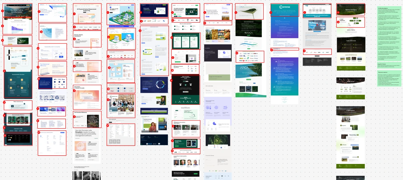
The second stage of discovery was benchmarking, which evaluated 10 direct and indirect competitors and the company's old site. From this research we identified the common points in use and defined an architecture.
Ideation
Hierarchy and content inventory work was done, along with low-fidelity wireframes for validation with the client.
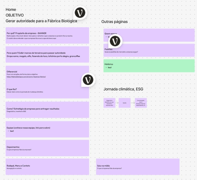
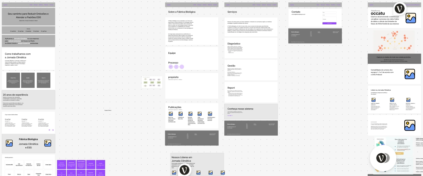
I worked on narratives with AI support to build the storytelling for the page, and I also based the content architecture on research into competitors' pages.
This was a collaborative effort with the client, which let us evolve the page structure quickly and iteratively.
Design
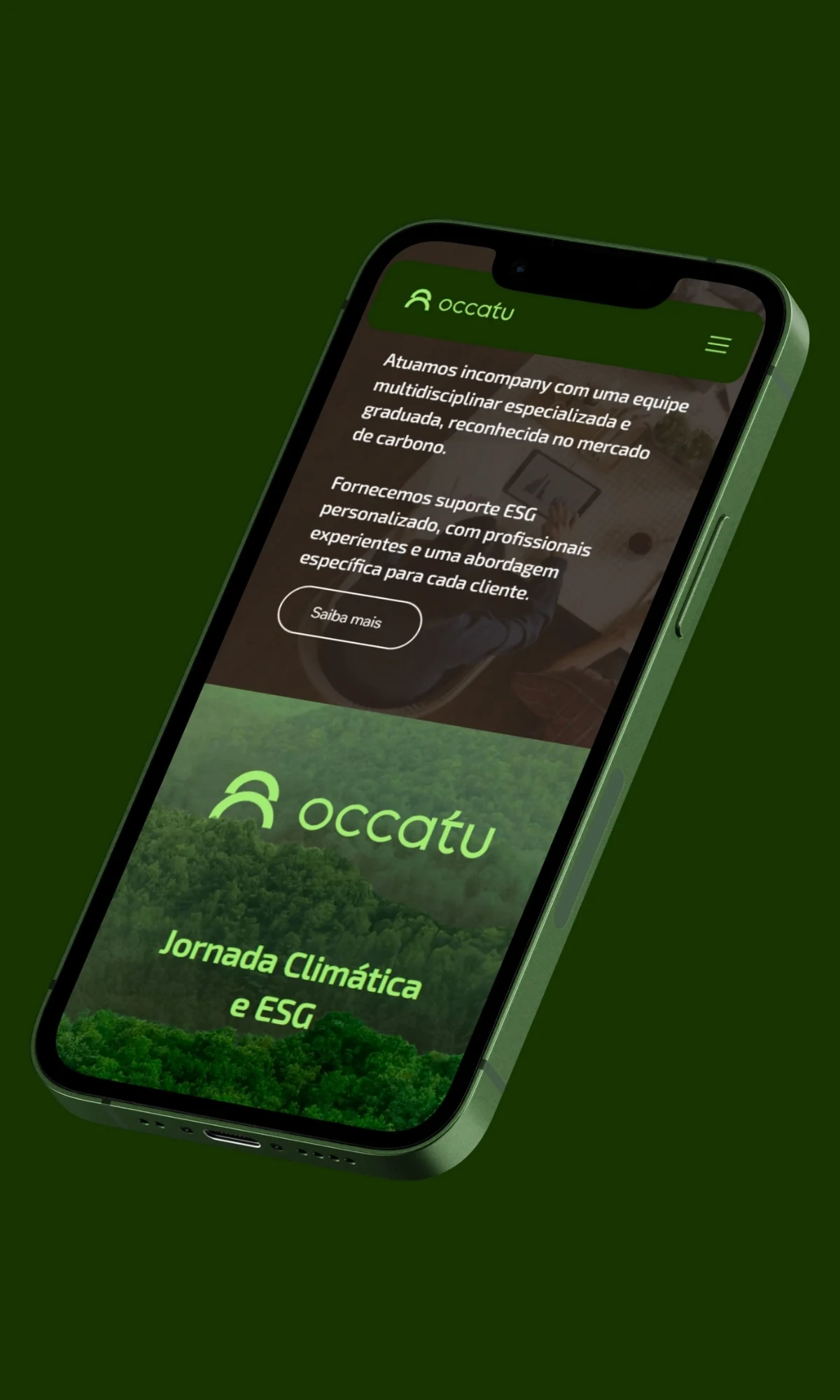
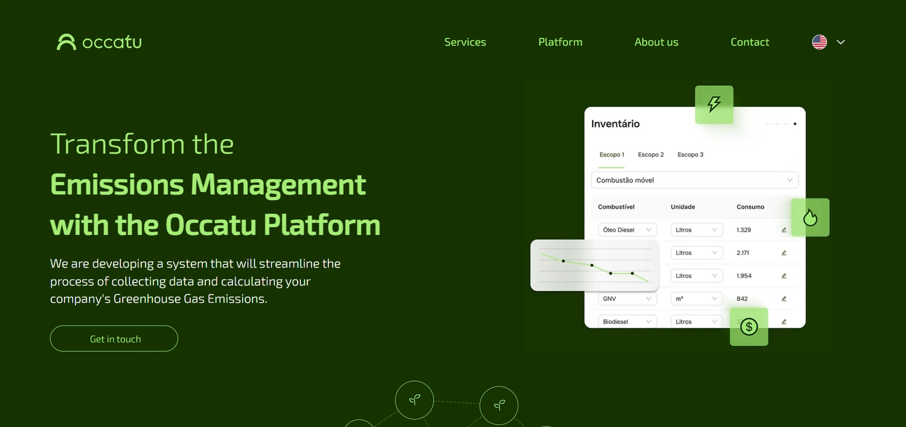
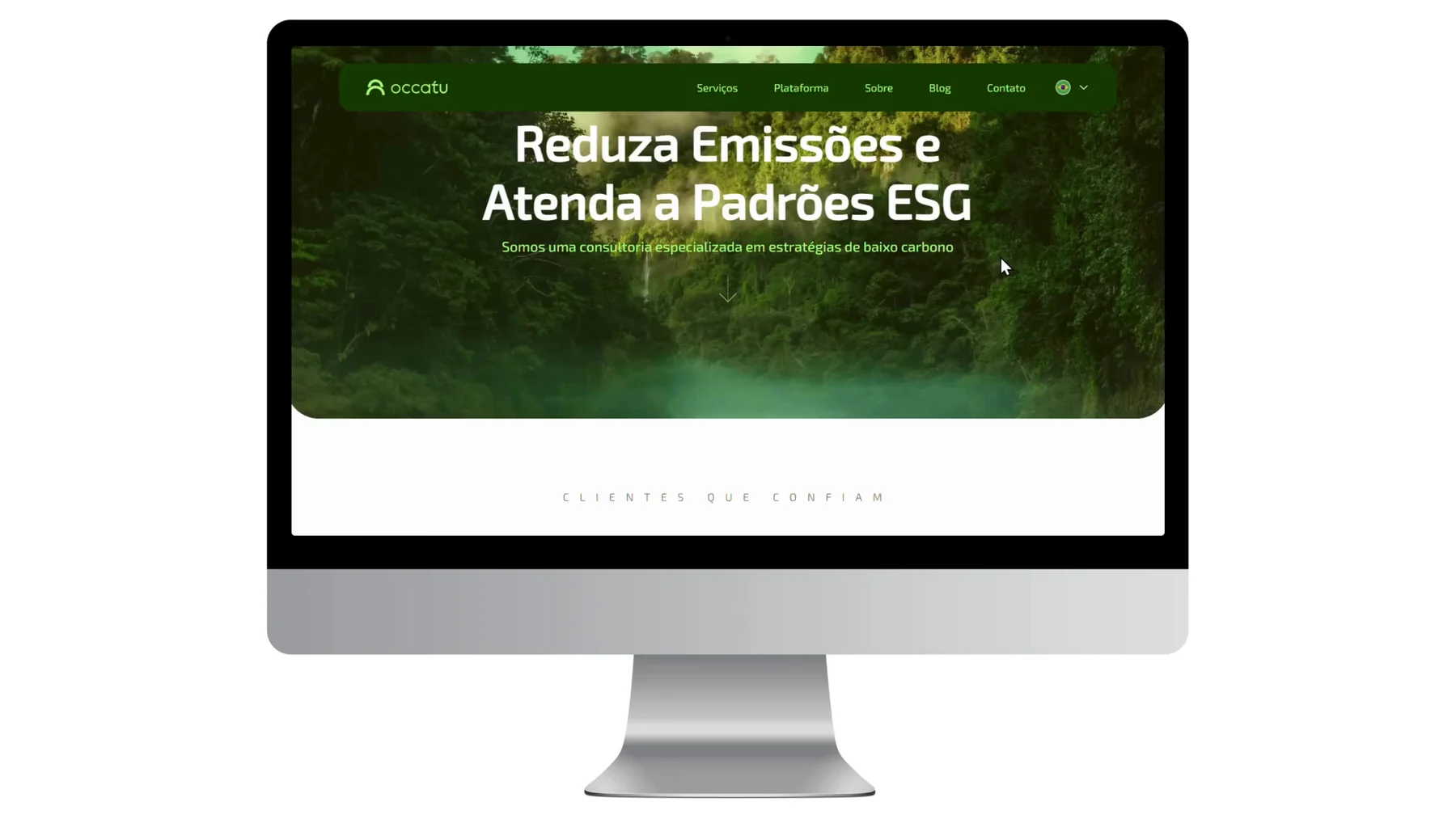
The visual concept was made in Figma, based on the visual identity and the project requirements. Another part of the web design was built directly on the front end, in code.
Launch
The launch was timed in coordination with the company's marketing team.
Results and learnings
Stakeholder management was a challenge, and I could have aligned expectations better and more often to speed up the process.
The launch was a success for the client, who was happy with the company's new positioning.
It would have been important to have some metrics from the old site to compare with the new one, so we could measure engagement rates.
Considering the current version, we could run A/B tests to improve engagement, as well as work more on the metrics.